HULUKU LABS BRAND
A comprehensive guide to our visual identity and brand voice
This guide contains the building blocks of our brand identity. Following these guidelines ensures consistency across all Huluku Labs communications and strengthens our brand recognition.
LOGO USAGE
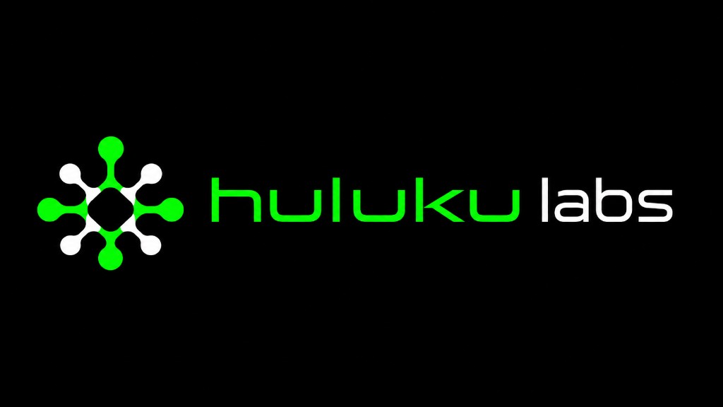
Wordmark + icon on dark background
Wordmark + icon on light background
Logo Guidelines
Clear Space
Always maintain a minimum clear space around the logo. This space should be equal to the height of the "H" in the logo.
Minimum Size
To ensure legibility, the logo should never be smaller than 100px wide for digital applications or 1 inch for print.
Incorrect Usage
- • Do not stretch or distort the logo
- • Do not change the logo colors outside of approved variations
- • Do not place the logo on busy backgrounds without proper contrast
- • Do not add effects such as shadows or glows
COLOR PALETTE
Neon Pink
Neon Blue
Neon Green
Black
Dark Gray
White
Color Usage Guidelines
- • Use neon colors as accents, not for large background areas or body text
- • Maintain consistent color associations: Pink for AI, Blue for IoT, Green for Clean Energy
- • Ensure sufficient contrast between text and background colors
- • When using colored text on dark backgrounds, use at 100% opacity for headings and UI elements
- • For a cohesive look, limit each design to 2-3 accent colors plus neutrals
TYPOGRAPHY
Primary Font: Inter
Secondary Font: Roboto Mono
Typography Guidelines
Hierarchy
- • Use clear size differences between heading levels
- • Maintain consistent heading styles across all materials
- • Use uppercase for buttons and small UI elements
Font Usage
- • Use Inter for all general content and headings
- • Reserve Roboto Mono for code, technical data, and accent elements
- • Avoid using more than these two font families
DESIGN ELEMENTS
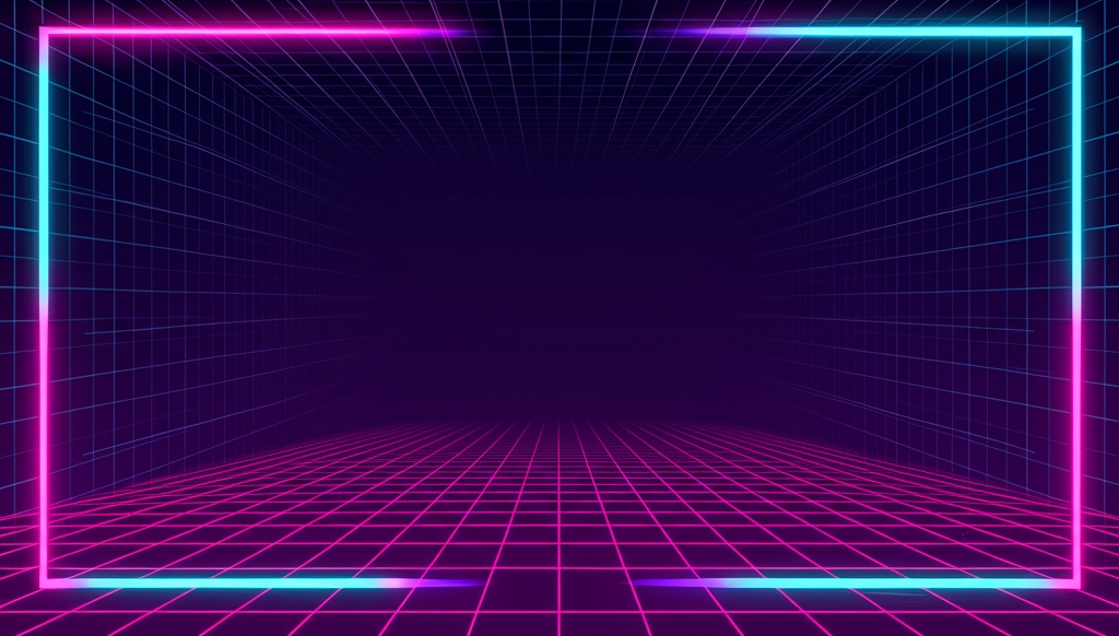
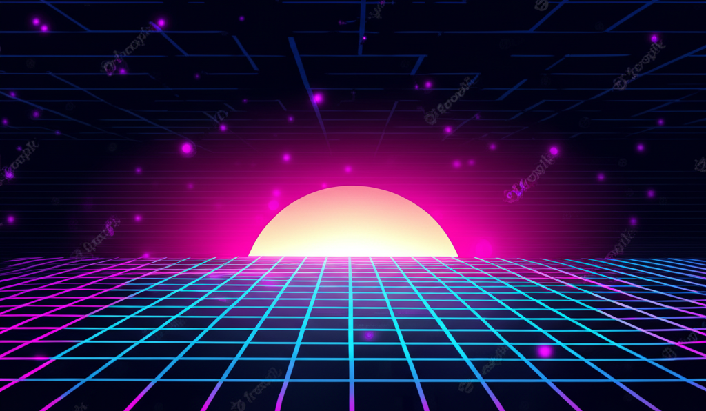
Grid Patterns
Grid patterns are a core element of our retro-futuristic aesthetic. They can be used as backgrounds, section dividers, or decorative elements.
- • Use with low opacity (10-30%)
- • Can be colored with any brand color
- • Vary cell size based on context
Scanlines
Scanlines add an authentic retro CRT monitor feel to our designs. They work best as subtle overlays on dark backgrounds.
- • Apply with very low opacity (5-15%)
- • Use horizontal lines with 1-2px height
- • Ensure they don't interfere with readability
Neon Borders & Accents
Neon-colored borders and accents are signature elements that add visual interest and reinforce our brand colors.
- • Use to highlight important content
- • Combine with dark backgrounds for maximum impact
- • Corner accents work well for call-out boxes
Glitch Effects
Glitch effects add a dynamic, high-tech feel to our designs. They should be used sparingly for maximum impact.
- • Reserve for key headlines or special elements
- • Ensure text remains readable
- • Combine with scanlines for an authentic retro look
Design Element Guidelines
Usage
- • Use design elements consistently across all materials
- • Combine elements thoughtfully - avoid visual overload
- • Ensure elements enhance rather than distract from content
Accessibility
- • Maintain sufficient contrast with background elements
- • Ensure decorative elements don't interfere with readability
- • Test designs across different screen sizes and devices
VOICE & TONE
Brand Personality
Innovative
We embrace cutting-edge technology and forward-thinking solutions.
Expert
We demonstrate deep knowledge and technical expertise in our fields.
Bold
We're not afraid to challenge conventions and push boundaries.
Approachable
We make complex technology accessible and understandable.
Purposeful
We focus on creating meaningful impact through our work.
Tone Guidelines
Do
- • Use clear, concise language
- • Be confident and authoritative
- • Explain complex concepts simply
- • Focus on benefits and solutions
- • Use active voice
- • Be conversational yet professional
- • Incorporate technical terms appropriately
Don't
- • Use unnecessary jargon or buzzwords
- • Be overly formal or academic
- • Make unsubstantiated claims
- • Use hyperbole or exaggeration
- • Be negative about competitors
- • Use passive voice excessively
- • Be vague about our capabilities
Tone Adjustments by Channel
Website & Marketing
Confident, visionary, and inspiring. Focus on possibilities and outcomes.
Technical Documentation
Clear, precise, and instructional. Prioritize accuracy and usability.
Social Media
More conversational and engaging. Show personality while maintaining expertise.
Writing Examples
Headline Examples
Pioneering the Future of Clean Energy Technology
Connect Your World with Intelligent IoT Solutions
Transform Data into Actionable Insights with AI
Product Description Example
Our AI-powered energy management system optimizes consumption in real-time, reducing costs and environmental impact. By analyzing patterns across your connected devices, it automatically adjusts settings for maximum efficiency without sacrificing performance.
Call to Action Examples
APPLICATION EXAMPLES
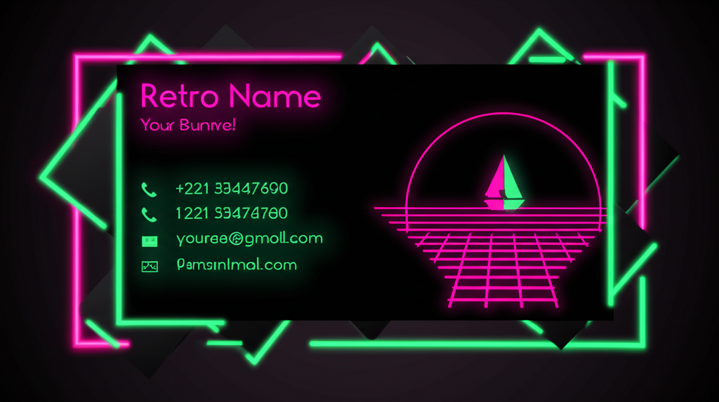
Business Cards
Business cards feature our logo prominently with neon accents against a black background.
Social Media
Social media graphics maintain our retro aesthetic with consistent use of grid patterns and neon colors.
Presentation Slides
Presentation templates use dark backgrounds with neon accents and our signature typography.
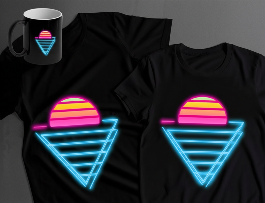
Merchandise
Branded merchandise incorporates our logo and design elements on high-quality products.
Brand Assets
Download our complete brand package including logos, color palettes, fonts, and templates to ensure consistent application of our brand across all materials.